
As the lead designer for Soteria RF Safety Consultants, I developed a full brand identity—including logo and website—for a company specializing in radiofrequency (RF) safety compliance. The goal was to create a clean, trustworthy, and professional look that would establish their presence in a highly technical field. I worked closely with the client to craft visuals that balanced technical precision with broad accessibility.
Logo Design
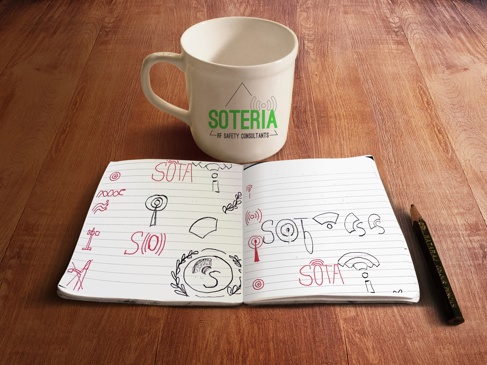
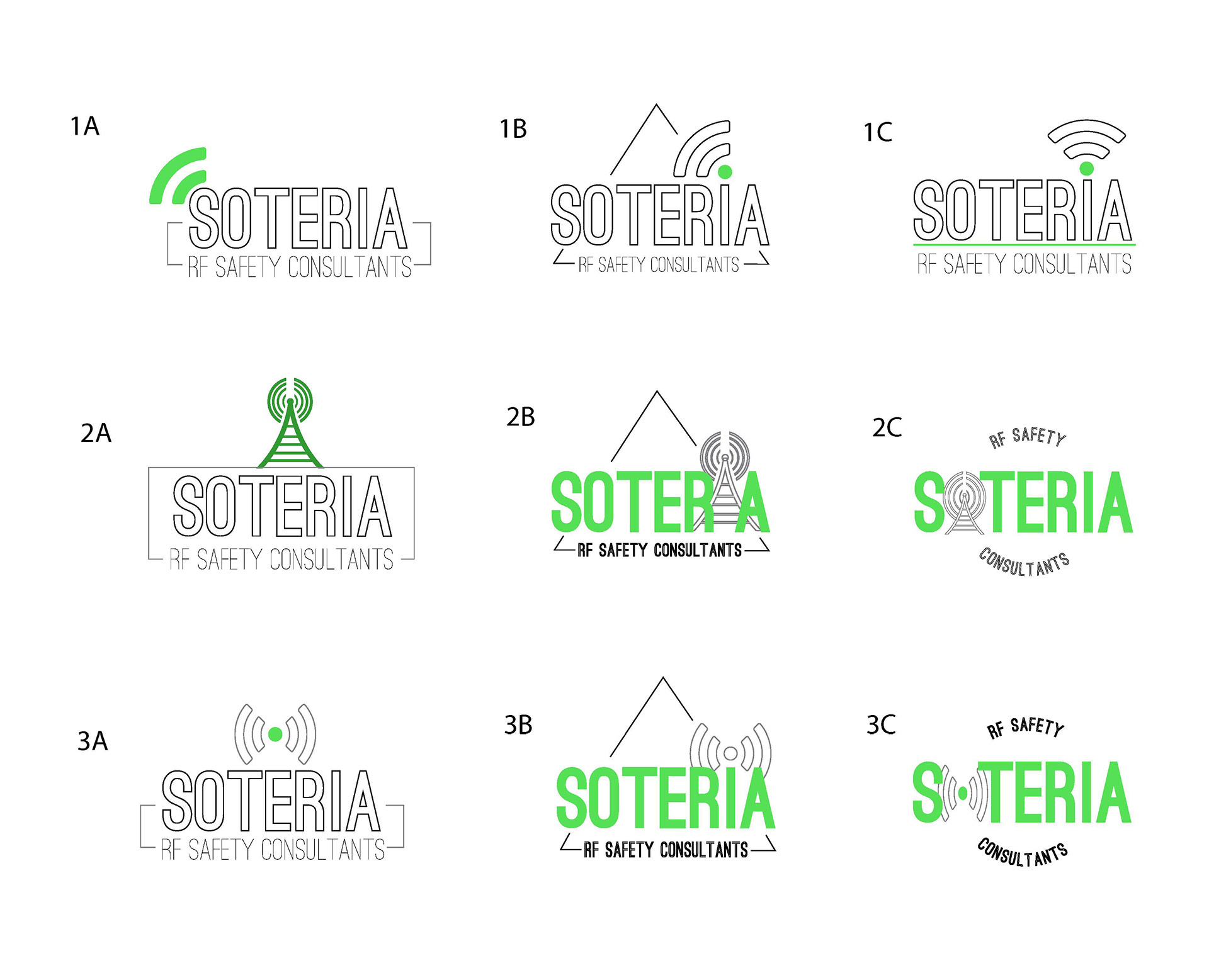
I began by exploring iconography that conveyed safety and professionalism, eventually landing on a geometric shield with wave-like forms. The shield signifies protection, while the waves subtly reference radio frequencies. A cool blue palette was selected for its associations with trust, calm, and technology.
The logo needed to function in multiple environments—from business cards to engineering reports—so I designed it with scalability and clarity in mind. All line weights and spacing were carefully calibrated to ensure it remained readable in both print and digital formats.
Tools Used: Adobe Illustrator
Website Design
For the website, I collaborated directly with the client to wireframe and build a Squarespace site that explained the firm’s services clearly. The layout was designed with accessibility and professional tone in mind, using a responsive structure and web-safe fonts for a smooth user experience across all devices. The interface follows simple, intuitive navigation to align with the firm’s goal of demystifying RF safety for clients.
Tools Used: Adobe XD, Square Space
Outcome
After launch, the client saw increased inquiries and positive responses from new customers. The clear branding and organized layout helped the company stand out in a technical industry where trust and communication are key.
Challenges & Takeaways
Designing for a specialized field like RF safety required in-depth learning to ensure visual metaphors were appropriate and accurate. I also learned the importance of designing branding systems that scale and perform consistently across both print and digital platforms. This project strengthened my skills in creating cross-platform visual identities and client collaboration.
Designed to represent trust and expertise, the logo combines a stylized shield with wave-like lines, referencing both safety and radiofrequency. The cool-toned green was specifically chosen for its visibility to individuals with color blindness, ensuring the brand remains inclusive and accessible across all visual needs. Clean lines and balanced geometry reinforce the company's professional and technical identity.
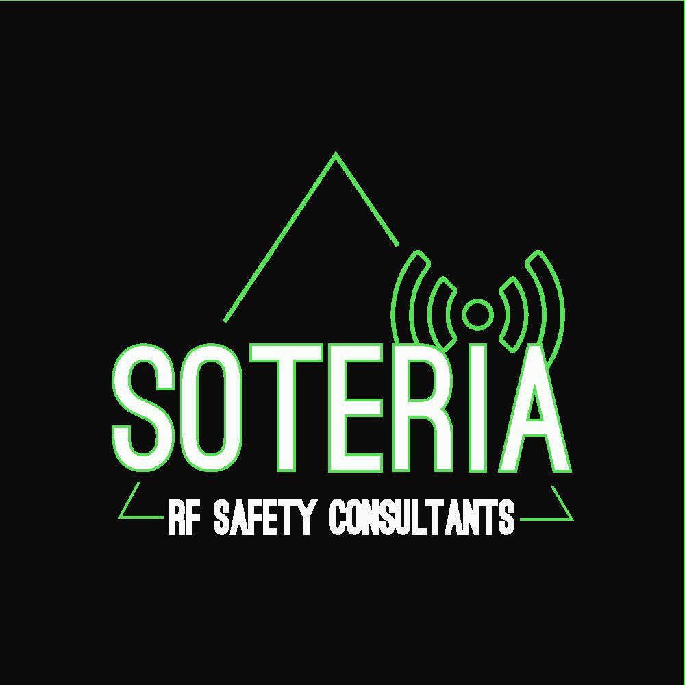
I developed the logo and website for Soteria RF Safety Consultants, a company dedicated to radiofrequency safety and compliance. The brand identity needed to communicate trust, technical precision, and accessibility. I carefully selected a color palette—including a shade of green optimized for color blindness—to ensure the logo was clear and inclusive to all viewers. Clean lines and a shield motif reinforce safety and reliability, while the website layout supports intuitive navigation and information clarity.
Want to see the full design in action?
Explore the live website here: https://www.soteriarf.com/
Explore the live website here: https://www.soteriarf.com/