
LevelHeaded is a mental health app designed to help users track their emotions daily through mood logging, journaling, and supportive mini-games. The app aims to create a safe space where users can recognize emotional patterns and build coping strategies. I led the UX design, crafting interfaces that balance intuitive interaction with emotional sensitivity.
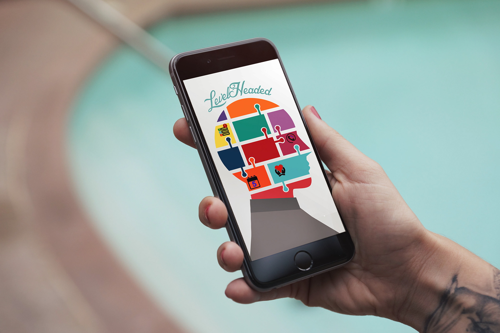
The app begins with a menu screen that allows the user to choose what they would like to select. There will be a screen at the beginning on how to use the app. On the face are the categories of what the user would like to do. The app is inspired by the style of the Balance app, but the home screen is always accessible from any point in the app.

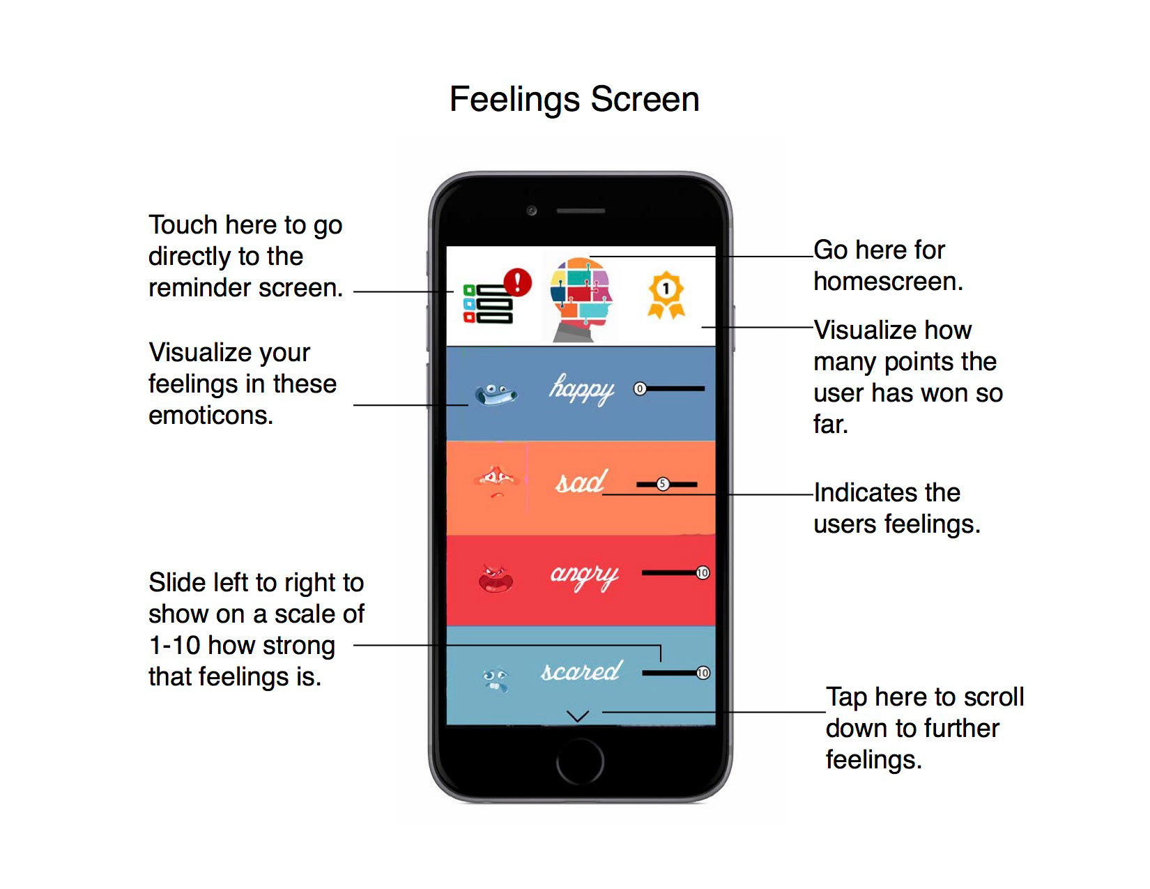
Here, the user selects a feeling from the list that best describes their current emotions. This is like gottaFeeling, but there are fun expressions and images that go with the feeling. This fun way of expression is seen later on in the app when the user charts their feelings.
Holding the phone in one hand, the user is able to press down with one finger or thumb. They may also hold the phone with one hand and swipe or press down with the other hand's index finger. There is no audio at this point in the app. This app is different than gottaFeeling, because new and interesting feelings will be updated all the time. The feelings can be measured on a scale of 1 to 10. Once a feeling is selected, the app navigates to the chart for the user.

Here, the user can see how their feelings over a period of days, weeks, months, and years match up with the other data. On the left of the chart is the user's feelings rating in points. Across the bottom are the days of the month, weeks, or years, depending on the user's preference for viewing the chart. Each point on the chart is designated by an emoticon. The user will be able to click on a point on the chart. The user's actions that day are listed as bullet points at the bottom of the page once they click on the emoticon.

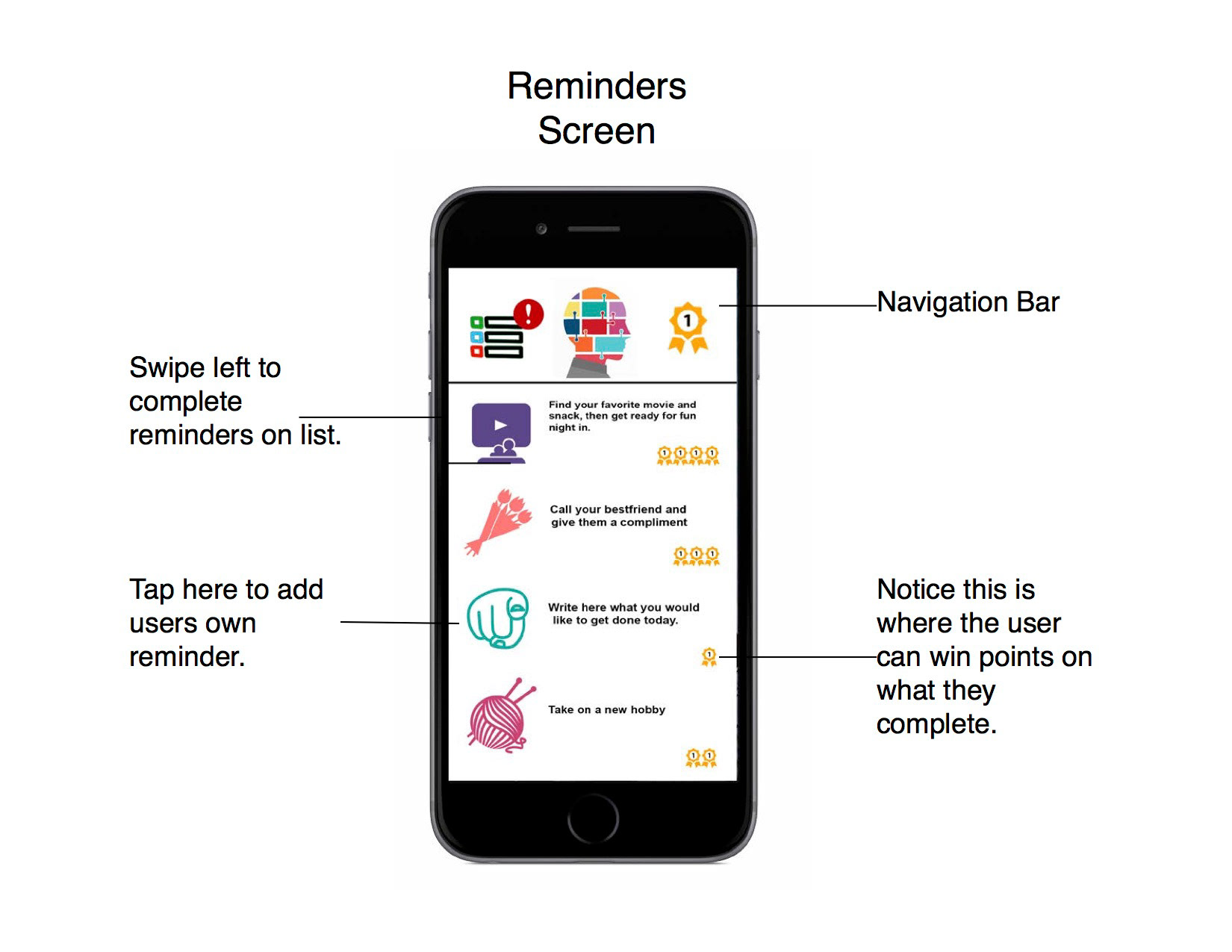
Here is the to-do list for the user. They can choose from existing options or make their own list. The more items on the To-Do list that are completed, the more points the user earns. This can be anything from giving yourself a hug today to taking your medication. Every time the user finishes an item on their to-do list, they hear a "ding" noise to indicate completion. The user swipes left to finish a task and right to edit a task, then scrolls down to see more choices. The more they complete, the more tasks are unlocked. This is more satisfying than SupperBetter because the user gets to control what they win, unlike SupperBetter, which has no option for the user to list their preferences.

Here is the reminder page. Which is linked to the already existing calendar on their phone. A list of reminders is at the bottom of the screen, along with a timer for each reminder. The current date is at the top of the screen, but the user can scroll left or right to other days.
This is the contact page. The main function of this screen is to call someone in an emergency. This screen will only appear if the warning on the app is triggered. This is similar to the SAM app, but even better because even if the phone is stolen, the user's information cannot be seen without the code. The information about the user can not be seen without the EMT code. The user has the option to inform EMTs of all necessary details, such as their current medications or any other important information. There are also relaxation tools for use during the ride in the ambulance or in an emergency situation.


Here is the iWatch heart tracker that tracks the user's heart rate. If the heart rate gets too high, an alert will pop up on the watch. The user will be asked if they are feeling OK. Then the user has the choice to dismiss the prompt, or the phone will alert an emergency contact.